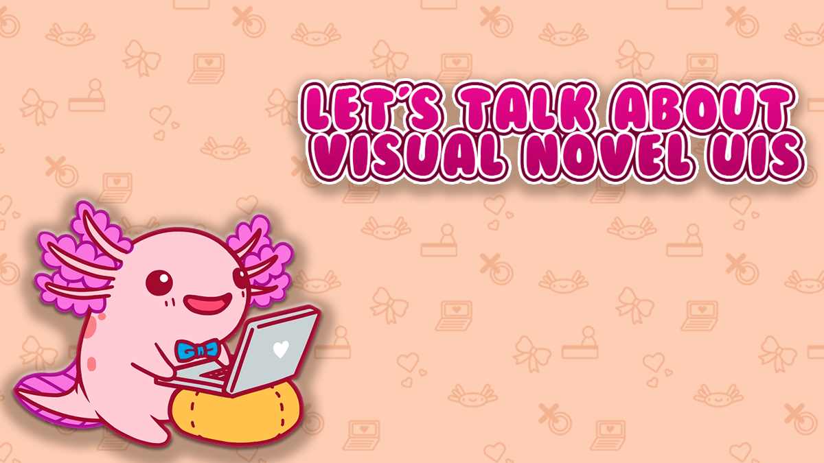
One of the biggest aspects of any game is its user interface (UI). For those not quite sure what a UI is, in terms of a visual novel, it’s your textbox, menu screens, and buttons. It’s what a player will use to navigate through the game, so it’s critical that a game’s UI is not only appealing but relatively simple and easy to understand. UIs are incredibly important to any game, including visual novels. There are many things to consider with a UI, but perhaps the two biggest points I’ve seen talked about amongst players and developers alike are style and functionality. If these two things are done right, then a visual novel will have a great UI. But how exactly? Why are these two aspects of a UI so important, and how can a developer get it right?
Matching the UI with the Style of the Game
With any game, you’ll want your game to come together and make one cohesive unit. At the same time, you want to make sure everything is easy to read and understand. For example, let’s take a look at a non-VN title, Cyberpunk 2077.
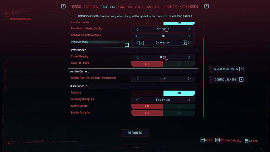
Cyberpunk 2077 takes place in a futuristic dystopian world heavily inspired by science fiction. Everywhere you go, technology is involved. In-game, the information displayed to you, such as objectives and keybindings for your weapons, is all displayed. When the player is injured during cutscenes, the interface will glitch, like how a computer might when one of its parts gets messed up. The menus are relatively simple with everything being clear, but it still carries the technology theme by using bits of code in the background. Even when the player is just browsing menus, they’re still immersed in the high-tech world they find themselves in.
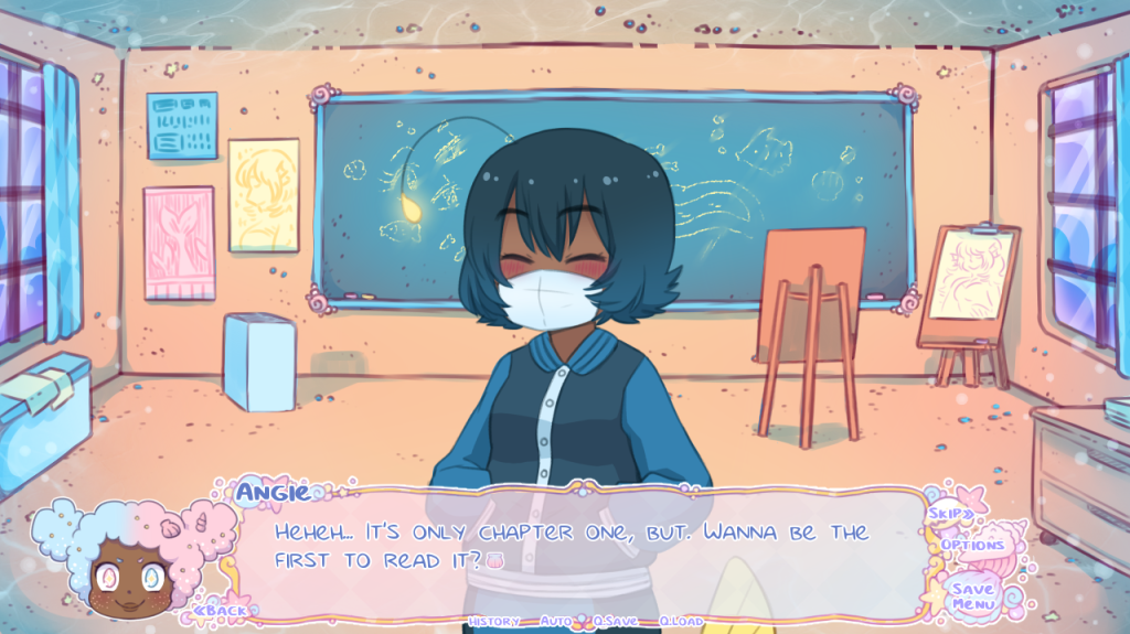
Visual novels can do the same thing. In Mermaid Splash! Passion Festival, the UI is very cutesy and has shells decorating the side of its textbox. The options menu has little shells that indicate what the player has selected. Like my previous example, the entire UI fits together with the overall feel and look of the game. This keeps the player immersed and wrapped into your world.
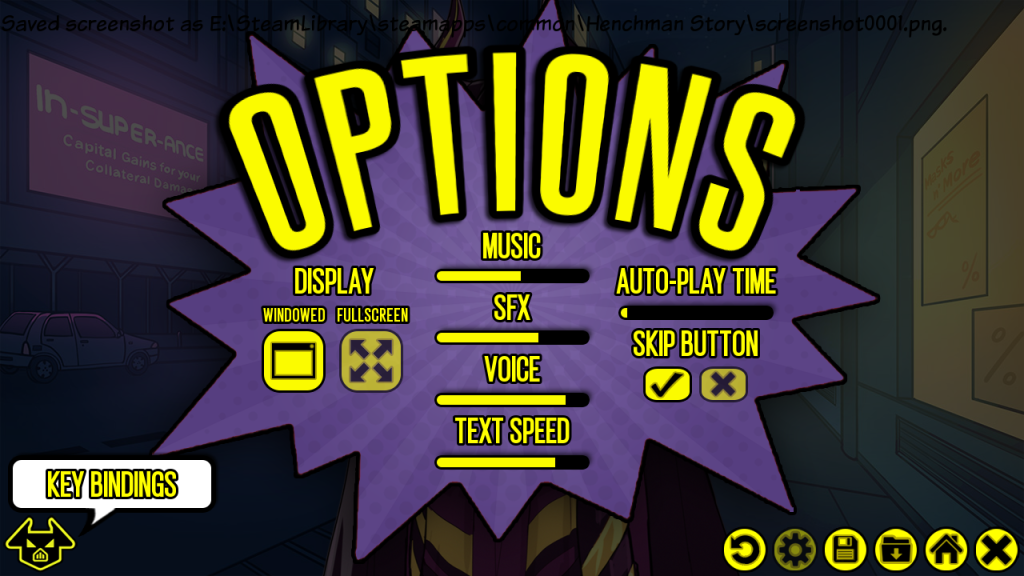
Another example of a good-looking UI comes from Henchman Story. Heavily inspired by comic books, the game certainly shows off its love for its source material. It has bright yellow text that catches your attention, as well as bubbles, such as the one pictured above, similar to those that you would normally see in a comic book. It’s details like these that help take visual novels to the next level.
But a visual novel UI can match the aesthetic of its game by going simple and maybe matching colors to its tone. In an article on Game Developer, Adian Arvyanda talks about their experience as an intern for Toge Productions, developer of Coffee Talk. One of the points that intrigued me was the talk about the game’s color palettes. It uses a brownish color palette that helps with the game’s relaxing and casual atmosphere.
This made me wonder, “Can a game still accomplish a good-looking UI even if isn’t complex like Henchman Story? Can a simple UI whose color palette matches the game’s overall tone be enough?” The answer to that is yes. Not all visual novels need to have these complicated UIs. I think, as long as it can come together in some way, then it’s doing its job.
Functionality is Key
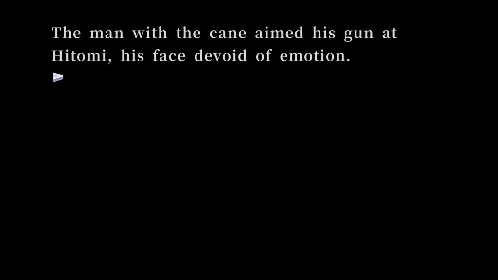
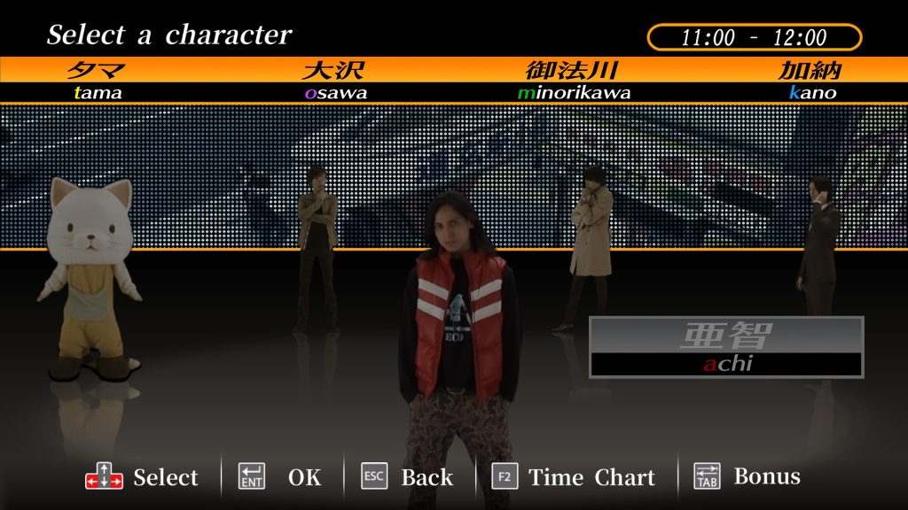
UIs need to have what players expect. There’s more to a UI than just its look. Another critical component of a UI is its functionality. Because visual novels are heavily text-based, there are frequently multiple routes to go on, and they can be long, you’ll want to make sure the player can easily save, skip text they’ve already seen, speed up text, etc. However, there are visual novels that take out the ability to do these things. Although this game is my favorite visual novel, 428: Shibuya Scramble does have its problems. First off, when you’re in-game, unlike in most visual novels, there are no quick buttons for the player to press. There aren’t even any keybindings at the bottom of the screen to indicate which buttons do what. If the player wants to go back to the character select screen, they’ll have to press random buttons and hope for the best. While I understand that this is a port of a Wii game, that’s no excuse to not have simple button displays telling the player what each button does, like we see with any other visual novel being ported from consoles.
Another issue this game has is the lack of a skip feature. The game has 80 bad endings, meaning that more times than not, you’ll get a game over and have to restart from the last checkpoint. Granted, you can hold down either Enter or Space to speed up the text, but it honestly doesn’t help much. It would have been much easier to have a skip read text feature so the player doesn’t have to hold down anything and the text could move much faster as a result. Plus, having this feature would prevent players from accidentally speeding through dialogue they haven’t seen yet.
Overall
From my experience, UIs are one of the hardest aspects to coordinate when creating a game. There’s so much to consider, and honestly? It can be overwhelming to someone who is just getting into game development. I’ve seen people get queasy when it comes to creating UIs. But, to some, it can be a fun experience. I think, as long as you remember style and functionality, then more people will see the enjoyment in creating something like this.